
OXYMEL LABEL DESIGN - VALLEY CLAYPLAIN FOREST FARM
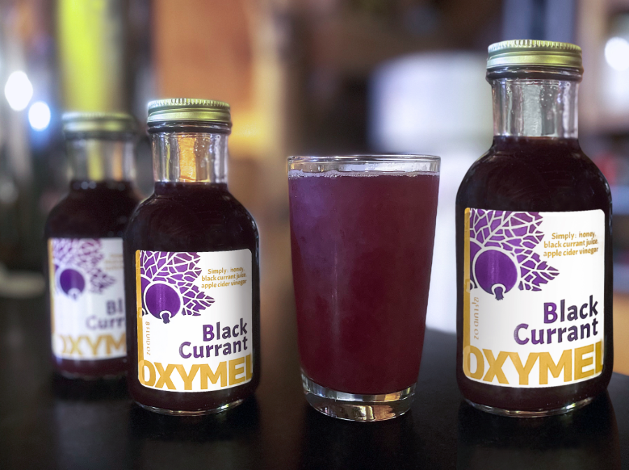
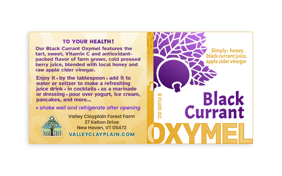
Oxymel label design that visually communicates home-grown, premium quality through minimalist design.
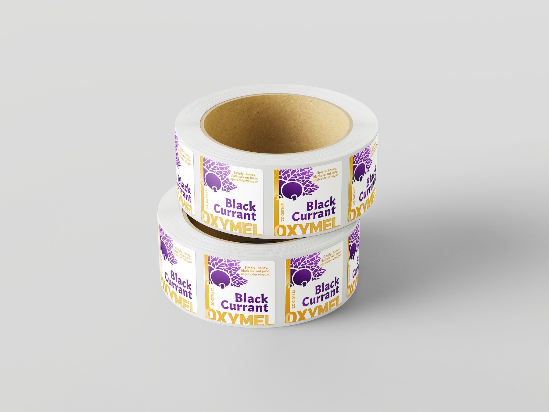
This oxymel label design project for Valley Clayplain Forest Farm presented a unique opportunity: translating the rustic charm of a homegrown, all-natural concentrate into a label that reflects its premium quality. The original label, a simple black-and-white block print design, sold successfully in stores for years, but as the product matured, the farm wanted a label redesign to match.
For the new design, I opted for a minimalist yet modern approach, letting the product’s natural essence shine through. A block print illustration of the key ingredient, black currant, adds a touch of handcrafted authenticity, while a gradient color scheme and Bold typography bring in modern elegance and a touch of unexpected flair. The final design bridges the gap between the product’s artisanal roots and its potential for broader appeal.
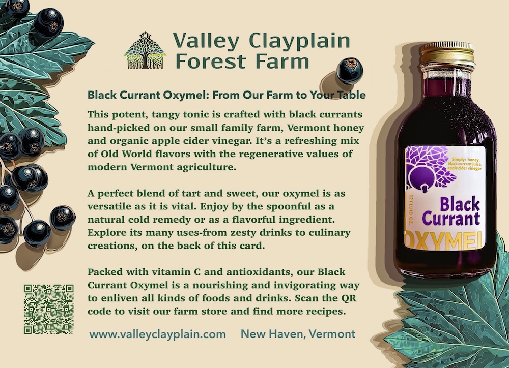
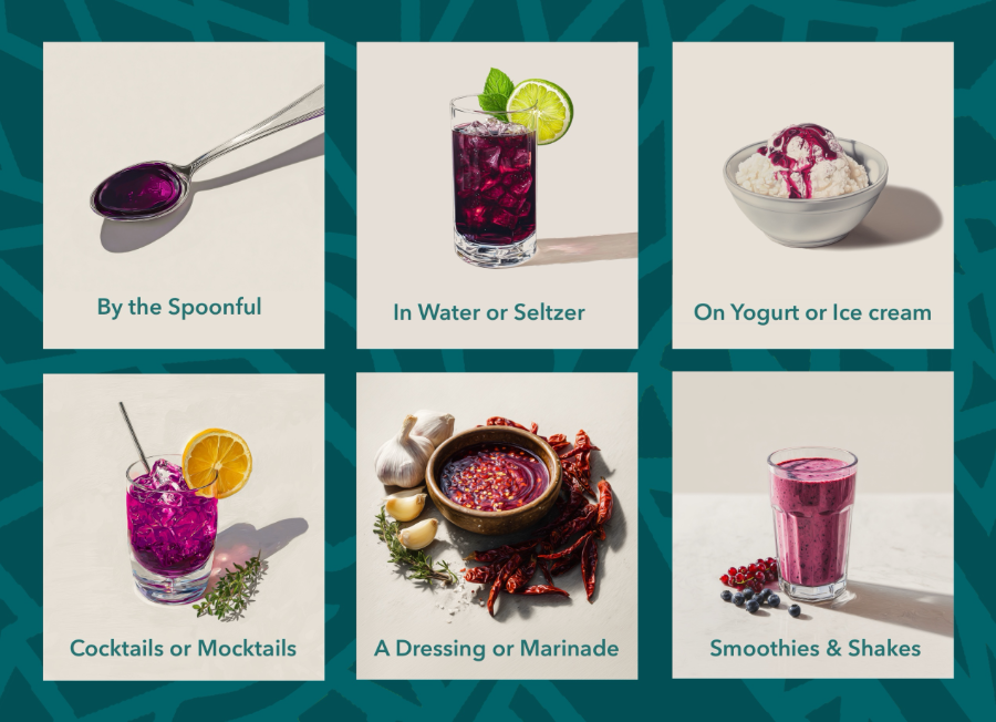
Beyond the label itself, this product info card design extended the story further, one side introducing the oxymel and its origins on the farm, the other illustrating six different ways to use it, from a spoonful straight up to cocktails, smoothies, and marinades.
See the full product line at Valley Clayplain Forest Farm. Oxymel label design like this is one part of the branding and print design work I offer.
PARTAGER
client
Valley Clayplain Forest Farm
date
january 2022 - September 2025
categorie
Label Design brand identity & Product Info Card Design
review
"Will Bode has been such an incredible design partner for our small farm business. His creativity, skill, clear communication, patience and reliability made the creation of the label for our black currant oxymel an exciting and thoroughly enjoyable process. Following a conversation on our farm’s values, vision and the specific details of our product, he crafted a series of graphics that gave us several quality options to choose from to represent our product. Following some detailed back and forth, he refined the design and developed a simple and attractive black and white label that our company used for several years. As we later went on to think more deliberately about what could help our product stand out in the marketplace, Will spearheaded a creative revisioning of our original label into an eye-popping, color rich reprise for which we’ve gotten glowing feedback from our customers and clearly helps our product stand out on the crowded shelves of store’s wellness departments. We couldn’t be more pleased with the end product, but equally telling was the ease and enjoyability of the process we experienced working with Will.
A few years later, we discussed an idea to develop a rack card for this very same product to tell the story of this versatile product and more clearly illustrate to our customers how to use it. I provided Will with a very rough concept for one side of the card that included some sketches of each of a series of panels depicting different ways to use our syrup. Within a few short days, Will had completely re-imagined these sketches into something that instantly looked clean, professional and beautiful. He also helped streamline and revise the copy text for the front side of the rack card, while creating a simple and attractive background that integrated our farm and product’s branding that he’d created for us in years prior. It’s been so wonderful to maintain a working relationship with someone who gets our business and our values and can so effectively communicate those ideas graphically."
Questions sur ce projet
Do you ever redesign a label that's already selling successfully?
Yes — this project started from a design (also done by WIll Bode Designs) that was already working in stores. The goal wasn’t to fix something broken, but to elevate an already successful product’s premium quality as the brand matured.
What makes a label feel handcrafted versus mass-produced?
A block print illustration style, rather than a photographic or overly polished graphic, keeps the artisanal feel intact even as the rest of the design becomes more refined and modern.
Does branding work ever extend beyond the label itself?
Often, yes — this project included a companion info card, giving customers real guidance on how to actually use the product, not just what’s in the bottle.