I craft logos that leave a lasting impact. My goal is to create distinctive, memorable designs that capture your brand’s essence. By understanding your target audience and business objectives, I create logos that not only look great but also effectively communicate your brand’s identity.
From concept to completion, I guide you through every step of the logo design process, ensuring your vision is brought to life. Let’s work together to create a logo that not only represents your brand but also elevates it to new heights.
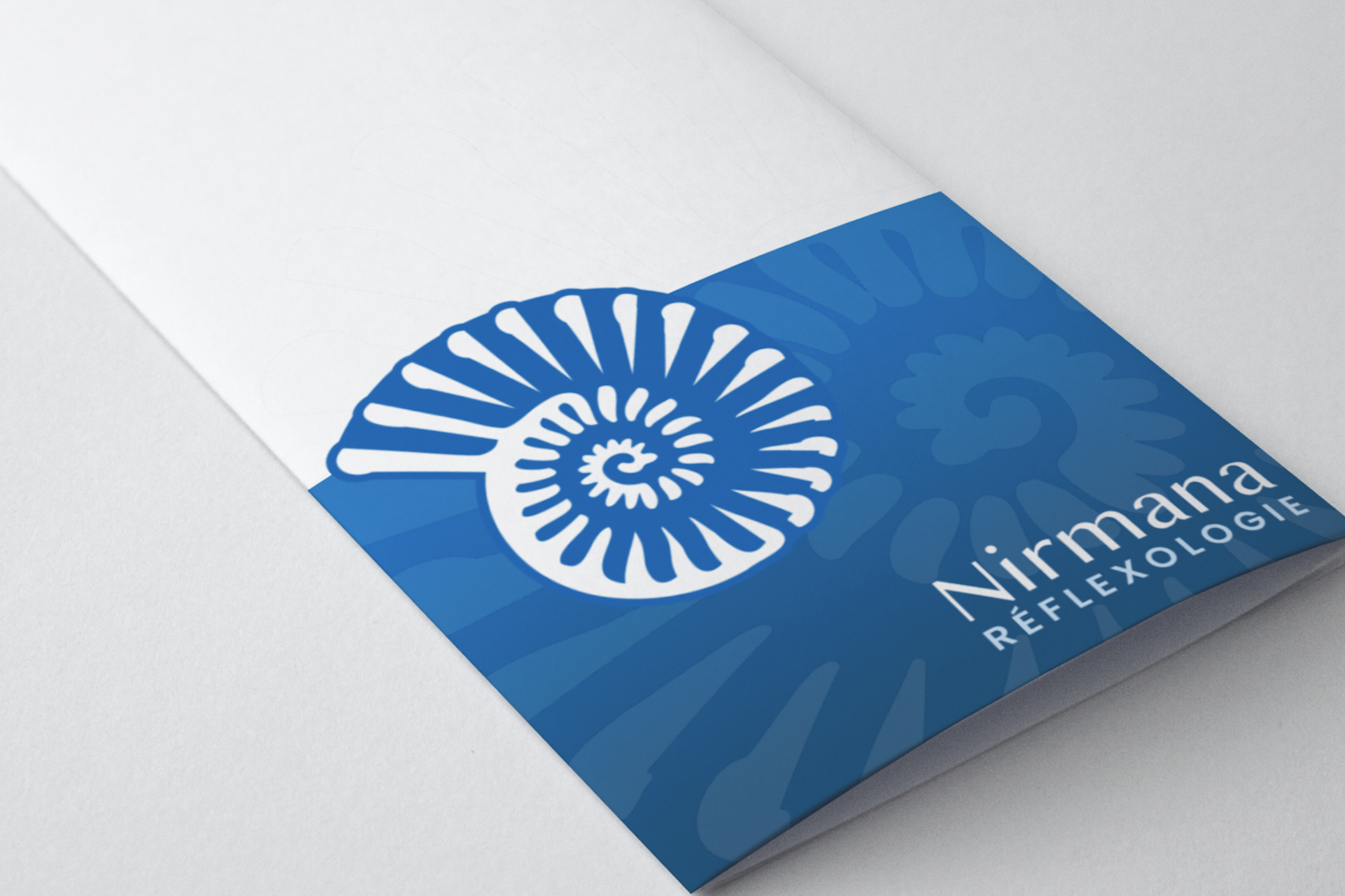
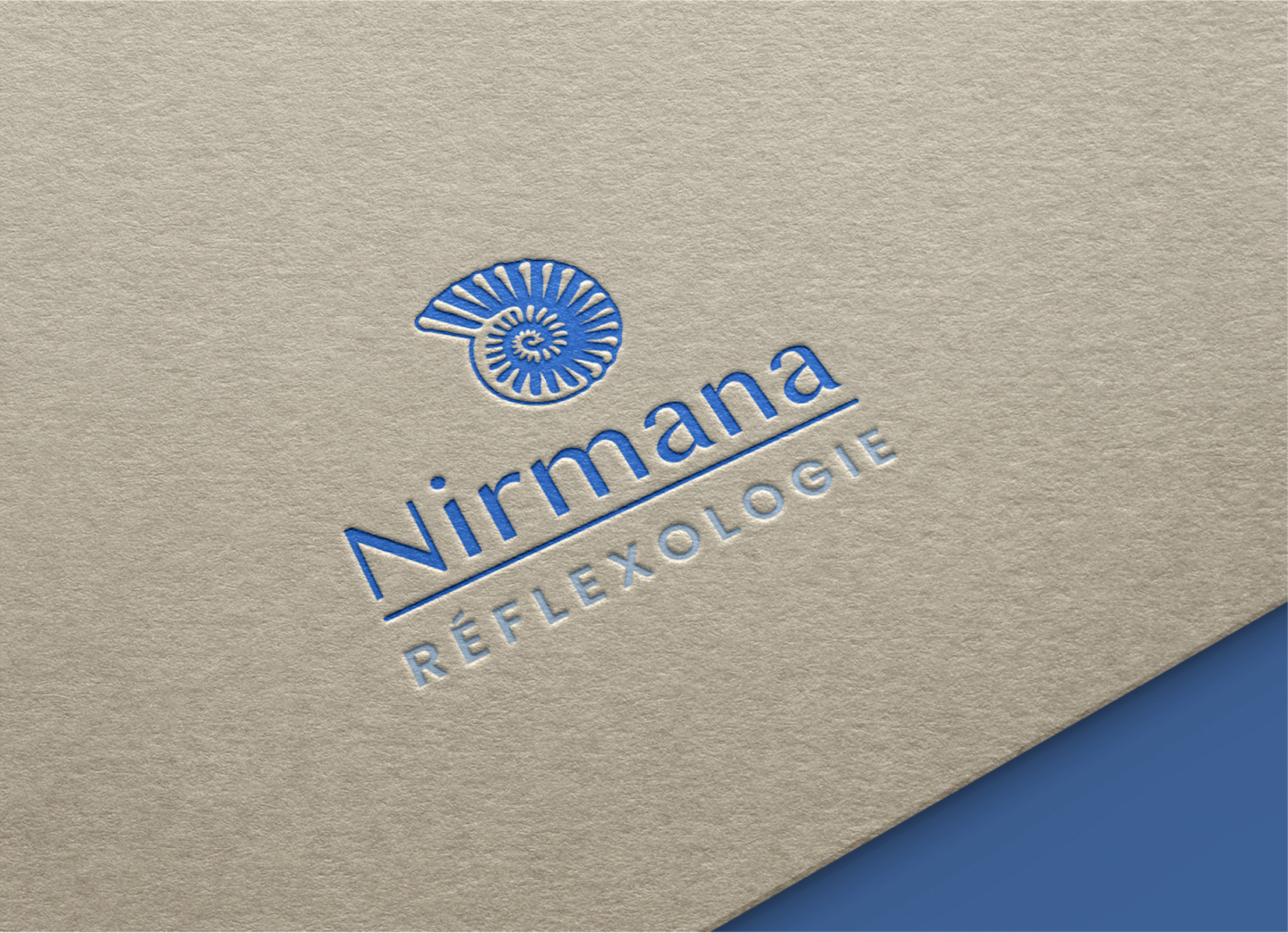
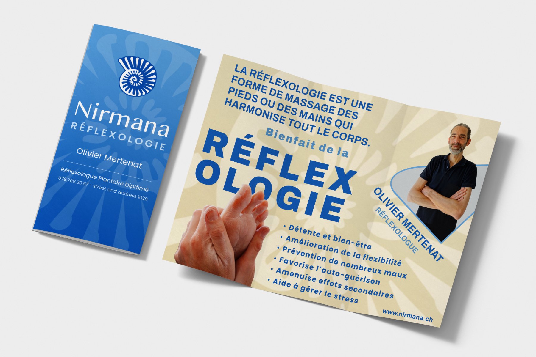
Nirmana, a brand rooted in healing and transformation, was created to support the launch of a new reflexology practice. Nirmana, the Sanskrit word for “creation,” carries the calm resonance of nirvana while standing apart with its own unique identity.
The logo, a modern, minimalist shell, reflects the golden ratio spiral, an organic form found in fingerprints, unfolding flowers, and patterns of natural growth, symbolizing harmony and regeneration.. Rendered in calming tones of blue, white, the design speaks to purity, clarity, and the quiet power of touch. Paired with elegant typography and a full visual identity, the branding sets Nirmana apart in a field often marked by generic symbols, offering a fresh and elevated expression of holistic care.
Glory Flower Farm, a sanctuary born from a family’s deep-rooted passion for nature and harmony. What started as a journey from the suburbs to the embrace of the land has blossomed into a haven where the Earth’s splendor is celebrated through vibrant blooms.
Our minimalist and elegant logo for Glory Flower Farm captures the essence of renewal and connection. Three flowers sway gently in the wind, surrounded by delicate buds and lush grass, inviting you to wander through a field of natural wonders. The subtle gradient from green to orange to yellow evokes a sense of movement and warmth, mirroring the flow of life itself.
At the intersection of upscale sophistication and rustic charm lies the logo we designed for Ferme du Bout du Monde, a prominent Permaculture Farm and Ecology Training Center in Belgium.
Inspired by the concept of ‘The Seed of Life,’ this emblem embodies a tapestry of archetypal patterns symbolizing sustenance and vitality. The harmonious palette of muted hues evokes the serenity of a twilight sunset over the fields.
With this emblem, Ferme du Bout du Monde asserts its unique identity, leaving a lasting impression that sets it apart from traditional farms in Belgium. Join us in cultivating a future of sustainability and elegance through thoughtful design.
At the forefront of holistic practices in Vermont, Keyline Vermont is a pioneering agency specializing in perennial food production systems, infrastructure development, ecological water management, and green building solutions. In their quest for a distinctive brand identity, we crafted a simple yet powerful logo that sets them apart from the competition.
Our inspired creation features a Vermont-shaped logo adorned with keylines, reflecting the essence of sustainable design and natural harmony. Infused with the warm hues of Vermont’s landscape, this emblem encapsulates the intersection of innovation and nature’s blueprint.
Mudblood Builds
Based in Denver, CO, Mudblood Builds is a leading natural building company renowned for their earth-based installations that seamlessly blend artistry with architectural finesse. Seeking a logo that exuded sophistication with a touch of nature, we drew inspiration from one of their iconic ovens to create a minimalist negative-space circle emblem.
Our logo design embodies the essence of refined naturalism, mirroring the hand-sculpted beauty of Mudblood Builds’ creations. The meticulously crafted typography harmonizes with the organic icon, encapsulating the company’s dedication to marrying art and architecture in perfect synergy.
Nestled in the heart of Central Vermont, Valley Clayplain Forest Farm stands as a beacon of regenerative agriculture and land stewardship. Guided by a deep reverence for the earth, they sought a logo that would embody their commitment to nurturing the land with an approachable yet upscale and contemporary flair.
Our design for Valley Clayplain Forest Farm captures the essence of harmony and sustainability with a touch of sophistication. Rooted in the ethos of caring for the land, this logo exudes a down-to-earth charm while embracing modernity.
Yogic Chai, a renowned loose-leaf tea company nestled in Montclair, NJ was seeking a refined and sophisticated logo to mirror the exceptional quality of their teas. They envisioned a yogi delicately indulging in a soothing cup of tea.
We made this vision a reality by streamlining and vectorizing the concept, ensuring its adaptability on both light and dark backgrounds. The outcome is a logo that encapsulates the soul of Yogic Chai – a harmonious blend of mindfulness and indulgence.
Malolo
This was a visual journey creating the Mālolo Catamaran logo, crafted for a worldly traveler hailing from Hawaii. Named after the graceful flying fish in Hawaiian, this logo project captures the essence of high seas escapades and oceanic exploration.
The logo mark celebrates the spirit of Mālolo with a dynamic swirl pattern representing the elegant trail of the flying fish. This intricate design detail adds balance and intrigue to the emblem, ensuring its captivating presence even when viewed in isolation.
We use cookies on our website to give you the most relevant experience by remembering your preferences and repeat visits. By clicking “Accept”, you consent to the use of ALL the cookies.
This website uses cookies to improve your experience while you navigate through the website. Out of these, the cookies that are categorized as necessary are stored on your browser as they are essential for the working of basic functionalities of the website. We also use third-party cookies that help us analyze and understand how you use this website. These cookies will be stored in your browser only with your consent. You also have the option to opt-out of these cookies. But opting out of some of these cookies may affect your browsing experience.
Necessary cookies are absolutely essential for the website to function properly. This category only includes cookies that ensures basic functionalities and security features of the website. These cookies do not store any personal information.
Any cookies that may not be particularly necessary for the website to function and is used specifically to collect user personal data via analytics, ads, other embedded contents are termed as non-necessary cookies. It is mandatory to procure user consent prior to running these cookies on your website.